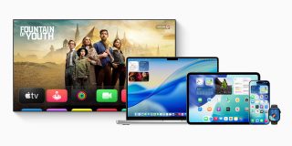
While I’m generally a fan of the Liquid Glass user interface, not everybody is. For some, it fails usability tests, while others are just not keen on the aesthetics.
Fortunately Apple allows a huge amount of control over the effects, and Adam Engst over at TidBITs has put together the ultimate guide for this …
One quirk is that the settings are very similar across different Apple devices, but they work in somewhat different ways. For this reason, Engst has chosen . He uses screenshots to preview the impact of each of the various changes.
The degree of control Apple permits is impressive. For macOS 26, for example, you can choose between the following options:
- Default
- Reduce Transparency
- Increase Contrast (and Reduce Transparency)
- Liquid Glass Off
- Liquid Glass Off, Reduce Transparency On
- Liquid Glass Off, Reduce Transparency and Increase Contrast On
- Liquid Glass Off, Per App
- Reduce Motion
It’s for anyone who isn’t happy with the default look and feel.
Via . Image: Apple .
FTC: We use income earning auto affiliate links. More.